

Design Guidelines
Get yourself ready for print!
Check these 4 things before going to print!
Creating press ready artwork may sound like an impossible task but it’s actually very easy! See the following checklist to help you and your Graphic Designer create press-ready artwork files that will produce breathtakingly beautiful prints every time!
We are here to help!
Dimensions
Colour
Resolutions
File type
Check that your artboard is set to the document size of your product.
The ‘document size’ for each of our products is listed under the Get Your File Ready option on the product information page. Make sure the height and width measurements of your design are set to the specified ‘document size’ parameters from the product page you’re trying to order when using your design software. Our pre-flight team will check this to ensure these parameters are exactly as per the product dimensions.
To allow for a margin of error when cutting your final print, the document size must include the correct amount of bleed. Check that images and backgrounds bleed past the artboard size to ensure no white or unprinted edge line on the final product.
Design Layout and Crop Marks
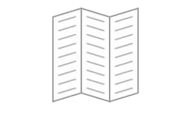
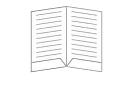
Provide 1-Up designs (One page per side)
Your design must include one page per side for all of our print options. Even if you want to print four pages per side (4-up), your document must be one page per side – we’ll construct the layout you want based on the parameters you choose online or discuss with a staff member in store.
If your design has numerous pages, the first page is always regarded the front page and the last page is always considered the back page of your print.
Supply Crop & Registration Marks
In your design, please include crop markings, trim lines, or registration marks.
Crop marks, trim lines, and registration marks are used by many professional graphic and print designers. In some instances, some design or typeset software doesn’t support crop markings, trim lines and or registration marks. Should this be the case, we require the artboard size to be increased to the final bleed size of the product. Do not alter the “safe zone” parameters as this needs to stay consistent throughout the design.
Stay within the "Safe Zone"
Most of our print products include a safe area where the design content can be placed properly. The Safe area prevents text or crucial image information from being cut off at the margin of your final printed page. So, before you start planning your next print project, review the safe zones to ensure you get a beautiful print.
Proof Check, Spell-Check REPEAT!
Perform a spell check and a final proofread on your design before saving it as a PDF print-ready file. Because spell checks don’t always pick up on grammatical issues, having a friend or co-worker that’s unfamiliar with your project do a spot check.
Set your resolution to 300dpi
Set your artwork’s resolution to 300 dpi.
Before you begin designing, set the resolution of your design to 300dpi.
We want your print to be razor-sharp and for you to be completely satisfied with our products. It’s critical to set your design to 300dpi before you start designing your print project. That way, you can be confident that the finished print will be crystal clear and something you’ll be proud to display.
What is dpi exactly?
Dots Per Inch (DPI) is a measurement of how sharp an image appears on printed materials. The sharper the image, the higher the dpi. In the printing industry, 300dpi is regarded the gold standard for quality prints. Using a resolution greater than 300dpi results in very little improvement noticeable to the naked eye.
After you’ve finished designing, scaling the resolution of your design to 300dpi will result in lower-quality artwork that will appear blurry when printed. So, before you begin designing, make sure your design resolution is set to 300dpi.
Colour Printing? Use CMYK Colour model
The CMYK colour mode is designed specifically for printing machines. This colour option consistently gives the best colour output across a wide range of printing machines. For the greatest effects, we recommend that all of your designs be created in the same colour mode.
The RGB colour mode is intended for visuals displayed on devices such as televisions and computer monitors. Although developments in digital print technology have enabled printing with RGB colour mode designs practical, when used with a CMYK printing process, colour consistency concerns might arise. When compared to the design objective, the colours will often appear distinct and unattractive.
If your design is in colour, use the CMYK colour mode; otherwise, use the Greyscale colour mode.
Your graphic design programme determines the colour mode of your work. The default is RGB, and you’ll need to change it to CMYK for printing. Inconsistent colour may occur when converting a document from RGB to CMYK hence the reason why we advise you to use the CMYK colour as part of your document or artboard setup.
What does RGB & CMYK Stand for?
What does RGB & CMYK Stand for?
CMYK stands for Cyan, Magenta, Yellow, and Key, while RGB stands for Red, Green, and Blue (otherwise known as Black). Each colour symbolises one of the fundamental colours.
What's the difference between CMYK & RGB?
What’s the difference between RGB and CMYK colour spaces?
Simply put, RGB and CMYK are two different colour representation systems. RGB is an additive colour model, which means that the more colour you add, the lighter it becomes. So, if you mix the brightest levels of Red, Green, and Blue, you’ll get white! CMYK is a subtractive colour paradigm that works in the opposite direction. Because the paper being printed on is expected to be white, this is the case. In CMYK, the opposite is true: increasing the colour levels of (Cyan, Magenta, and Yellow) to their maximum results in black! The print will appear lighter if the colour levels are reduced.
The Key colour (black) is used to generate a pure black in CMYK because Cyan, Magenta, and Yellow do not produce a pitch-black, therefore the addition of the 4th colour in CMYK.
When should the Greyscale colour model be used?
The Key colour (black) is used to generate a pure black in CMYK because Cyan, Magenta, and Yellow do not produce a pitch-black, therefore the addition of the 4th colour in CMYK.
When should the Greyscale colour model be used?
The Key colour (black) is used to generate a pure black in CMYK because Cyan, Magenta, and Yellow do not produce a pitch-black, therefore the addition of the 4th colour in CMYK.
Spot Colours? What are they?
SAVE as a .pdf
Save your design into a PDF document with fonts embedded.
It is recommended that you save your final design file as a PDF (Portable Document Format) before sending it to us for printing for the best results. PDF is a secure, read-only format that has evolved through time for the secure transmission of documents between organisations and individuals, and it is widely accepted (and favoured) by printers.